The Story of a Cover
 Wednesday, April 21, 2021 at 11:10AM
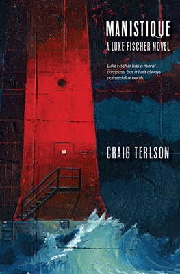
Covers are hard - we all know that, right? Even great book designers like Chip Kidd know that. How do you capture what's in a book, and at the same time intrigue a buyer to pick it up (you know, like in one of those actual stores)? Oh, and make it beautiful, too.
Just to add - I've learned a lot from Kidd in this regard. I use his work (and Ted Talks) to inspire my design students... and myself.
Even though my day job is graphic designer, I have found that book covers are amongst the most challenging of projects - they are also the most fun, and the most rewarding.
For both my traditionally published books, and of course my independently published books, I've designed the covers. Sometimes I've just asked the publisher if I could have first shot at the cover. This happened with my novel, Fall in One Day, published by Blue Moon. I was channeling Saul Bass pretty hard (as I'd been teaching about him in one of my classes.) But it was also the vibe I wanted for the book set in 1973. Here I combined graphic leaves falling through a series of "Bassian" squares (hey, I just made up that term!) As they fall, the leaves become more psychedelic, which points to the role that the early history of LSD plays in the novel.
I love when a cover can offer an "Easter Egg" to the reader.

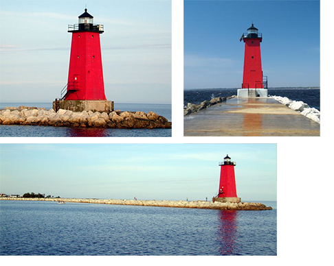
For my new novel, Manistique. I had an idea right from the beginning... picture the famous Manistique lighthouse (The Manistique East Breakwater Lighthouse) with a backdrop of the choppy waters of Lake Michigan. A lot of the book takes place in this small town in Upper Michigan, and I saw the lighthouse as a symbol of what the protagonist faced as he helped investigate a pair of murders. Of course it helped that the lighthouse is blood red.
I also had a desire to ask a certain friend from art school if he would do the painting. Even two years ago when I finished the novel (for the first time) I thought about his paintings. His name is Phil, and he is one helluva painter/illustrator - we used to share a studio together when I lived in Toronto. Phil's work is in demand, and you can see why... so I would understand if he said no.
I was completely over the moon when he said yes.
We started the process by me sending him some ideas and photos of the lighthouse - we also talked about the mood of the book, and I sent him some excerpts that mentioned the lighthouse.
When he sent me the first sketches, I knew already that I was going to love it.
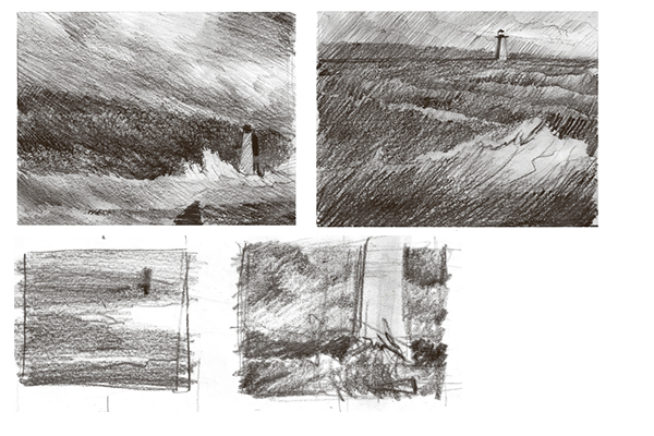
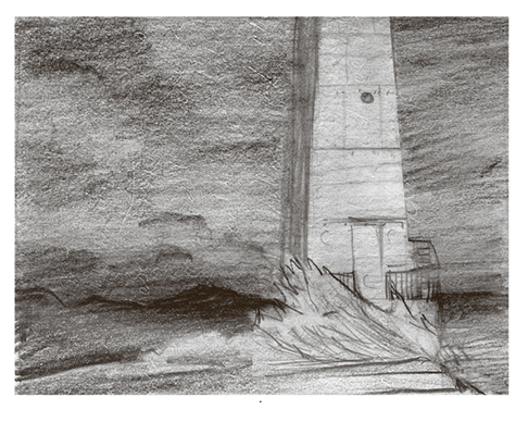
After some back and forths (me with my art director hat on) Phil delivered the final scan of the painting, and I was floored. It was better than I'd imagined. It captured exactly that right mood and feel. Some people have commented that it looks retro, but at the same time new. As well, it fits into a literary genre as much as a crime fiction genre... which is basically what I do.
Here is a look at the full cover wrap.
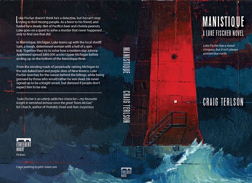
To see more of Phil's work, visit philart.ca or his agent's website i2i.art.com
Phil, I love you buddy. Thanks so much for doing this!!!
Manistique official launch date is June 15, 2021
- but books will be available before then. If you are a book blogger or reviewer drop me a comment here or over on twitter @cterlson - and I'll see if I can hook you up with an ARC.


Reader Comments